Market Morsel: Australia vs the world

Market Morsel
Earlier this week, I was chatting with a farmer about productivity gains in Australian wheat production. It got me thinking about how our yields compare to the rest of the world.
Australia is undeniably an efficient producer of wheat, considering our soils and climate. Throughout Australia’s period of growing wheat, farmers have used the newest technology and science to generate greater yields.
However, how does our advance in yields compare with other nations around the world?
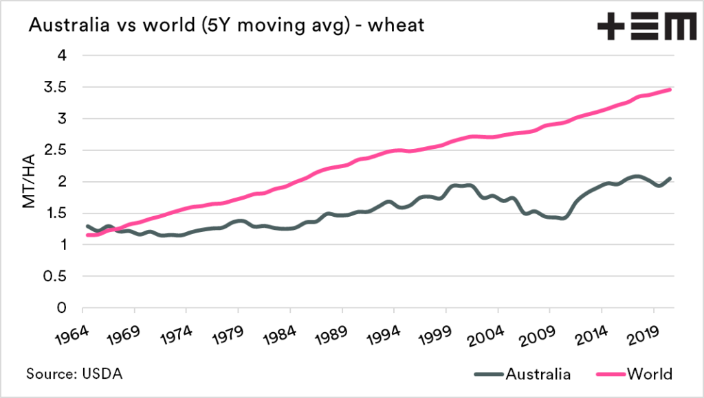
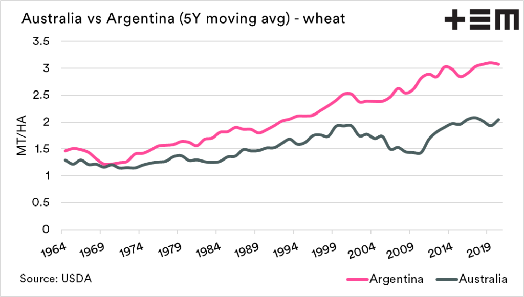
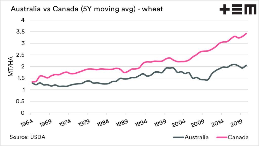
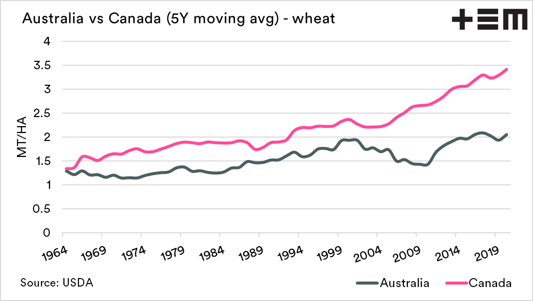
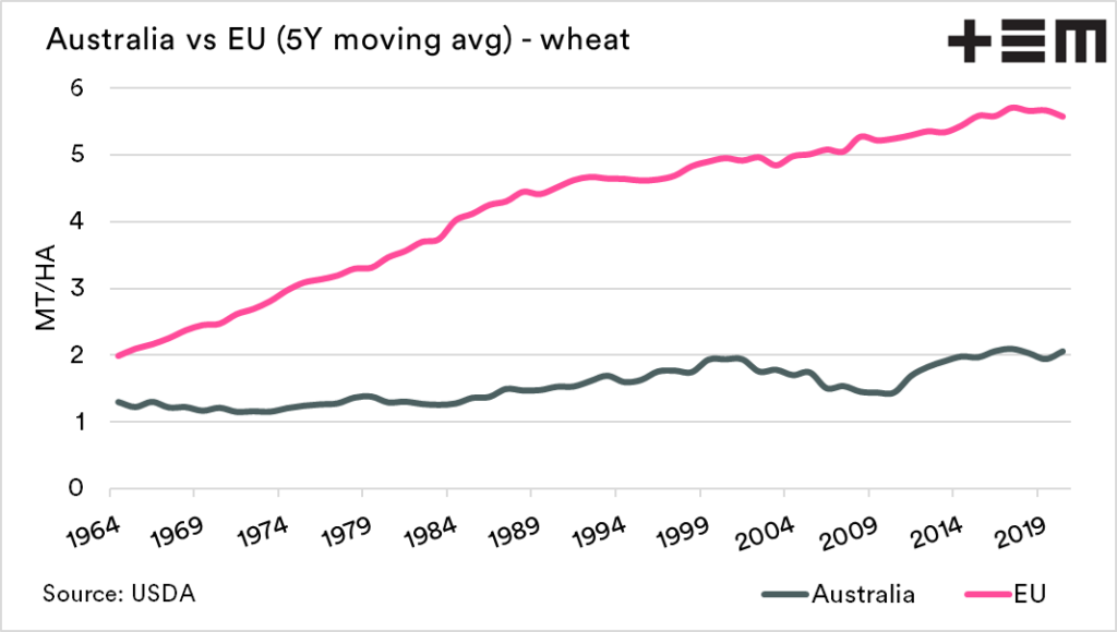
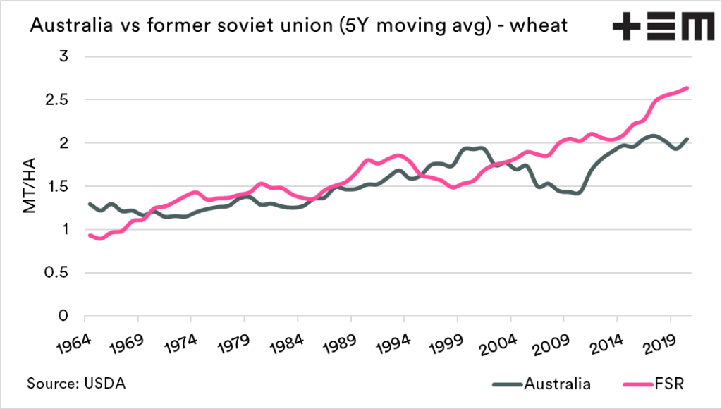
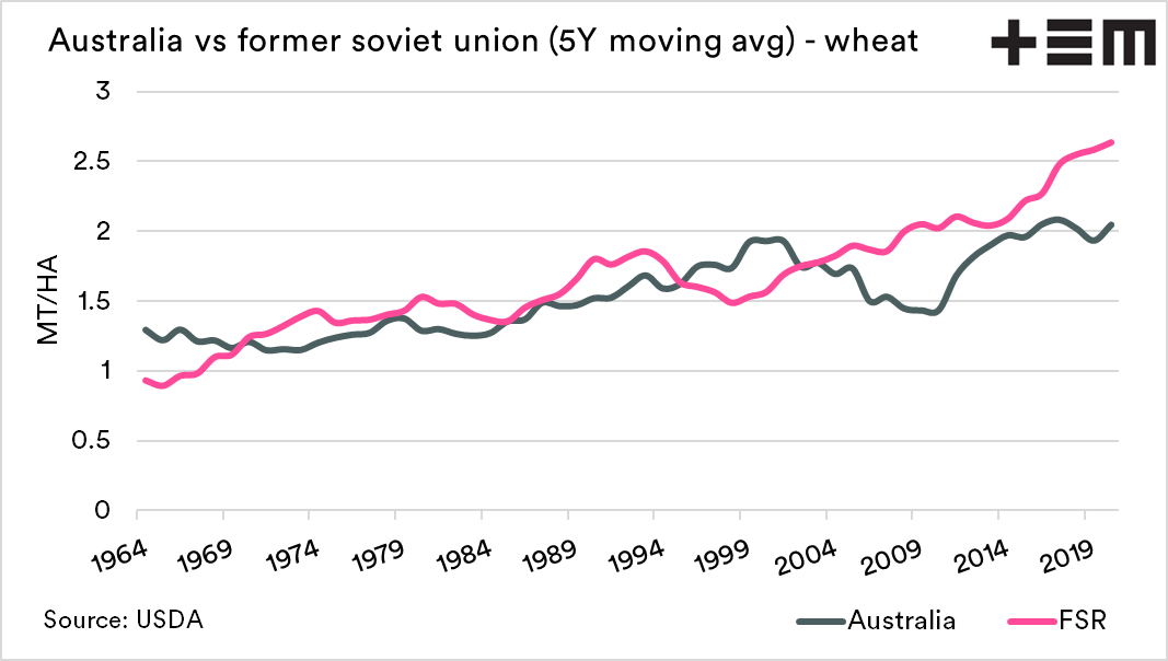
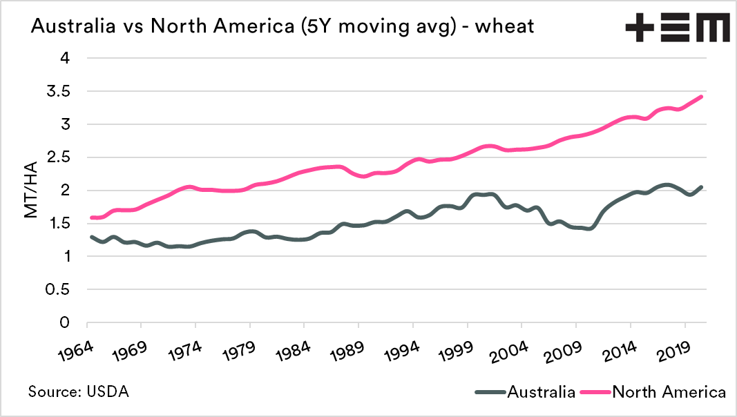
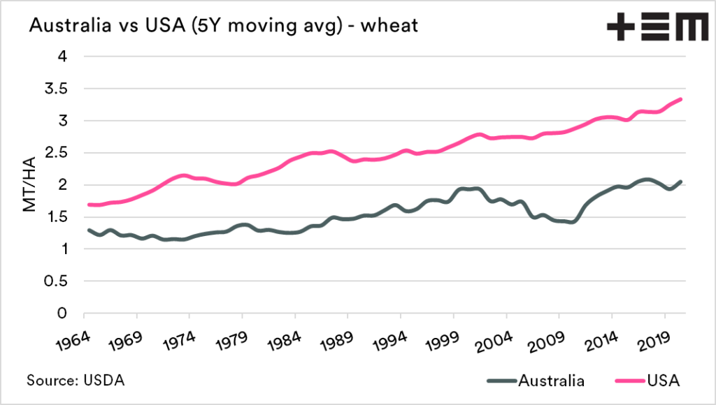
The charts below show the 5Y moving average yields for Australia, versus a range of different countries/regions.
- World
- Argentina
- Canada
- EU
- Former Soviet Union nations
- North America
- USA
By separating into different regions, we can get a better comparison than the more simplistic world comparison.
The main purpose is to show the trend in yields over time and whether we are trending at similar levels to other regions. There are newly developed growing areas such as the Former Soviet nations in these regions, and more developed such as North America and Europe.
A very basic look at the charts shows in the majority of cases, yields advancing at a slower rate in Australia versus other regions, both established and new.

