Market Morsel: Yield to me.

Market Morsel
Australia has had some ripsnorters in recent years, with wheat yields flying through the roof. A friend of EP3, Nigel Hart, asked us about wheat yields over the long term in Australia (see here).
We keep track of a lot of data that we think might be useful, including a pretty extensive production dataset for Australia.
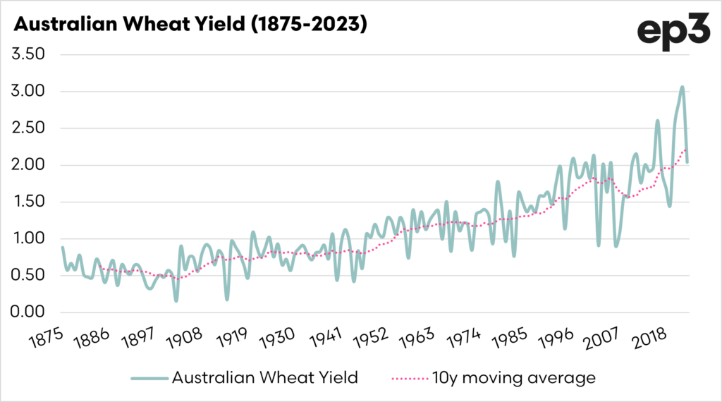
The first chart below shows the annual yields for wheat across all of Australia, overlaid with our 10-year moving average.
In the period 1875 to 1885, our annual wheat yield averaged 0.61mt/ha; in the past decade, the wheat yield has been 2.2mt/ha. It would have been pretty tough doing a 2.2mt/ha average back then when wheat was all bagged! Our wheat yields have increased by 260%.
Will we start hitting natural constraints, or will we continue higher and higher? Who knows? How do we compare against some of our competitors?
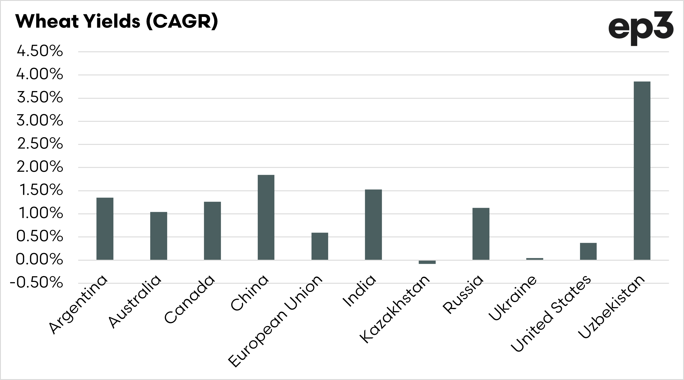
I have chosen a selection of competition nations in the second chart below, which displays the compound annual growth rate of wheat yields based on the period 1990 to the present.
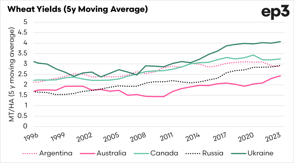
It is important to note that Australia comes off as pretty poor compared to many of these nations. However, many of these nations were developing nations or had just left the soviet union, which meant they were largely starting from a lower baseline.


