Decile Drop: Wheat and Barley decile tables

Decile Drop
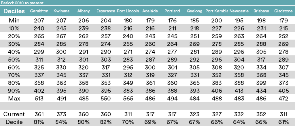
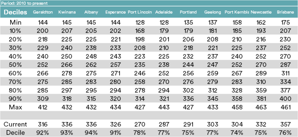
The tables below display the spot APW and F1 barley price for ports around Australia. These tables are of the timeframe 2010 to present.
The tables display nominal prices relevant to each decile range, which can be used to get an understanding of how high (or low) the current price is in relation to historical pricing. A decile table measures how often, historically, prices have fallen above (or below) a particular pricing point.
It gives a brief snapshot of whether a market has more upside or downside and how large this may be.
For example, if a price is at its 40% decile, this means that 40% of the time, prices have been below that value and 60% of prices higher.
Similarly, a 90% decile means that 90% of the time, prices have been lower and higher just 10% of the time. Please note that a price can’t reside outside of the 100 percentile.
At the bottom of each table is the current price and the percentage decile ranking for that price.
Comment:
Deciles are used as the primary tool by many analysts around the country. However, I feel that they should be used in conjunction with other tools to get a market view. The reason I am reluctant to use deciles too much, is due to the extremes, at the moment if you look at the current pricing levels, the market is at relatively high levels. The difference between the 100th percentile and the 90th percentile is extreme.
If we forget the last couple of years of extreme pricing, the current prices are very attractive. However, as we all know, we can’t forget those recent years.