
Is grain cheap compared to fertiliser?
The Snapshot
- Australian fertiliser pricing lacks transparency. However, we have modelled an approximate import price with our partners at CRU.
- Fertiliser pricing has risen dramatically this year.
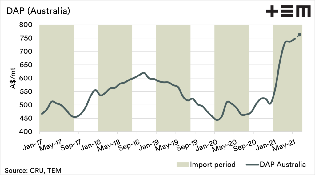
- The import model has Dap at A$763, up A$199 since the start of the year.
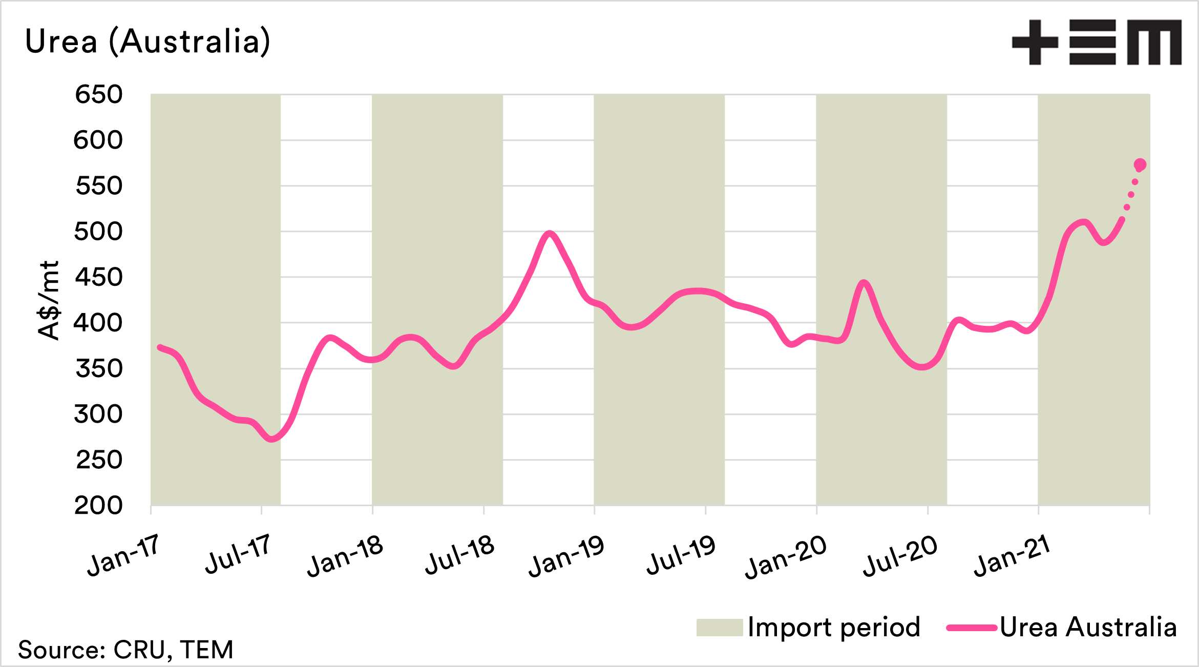
- Urea is at A$573, up A$148 since the start of the year.
- There is a relationship between grain pricing and fertiliser pricing. They tend to follow similar trends.
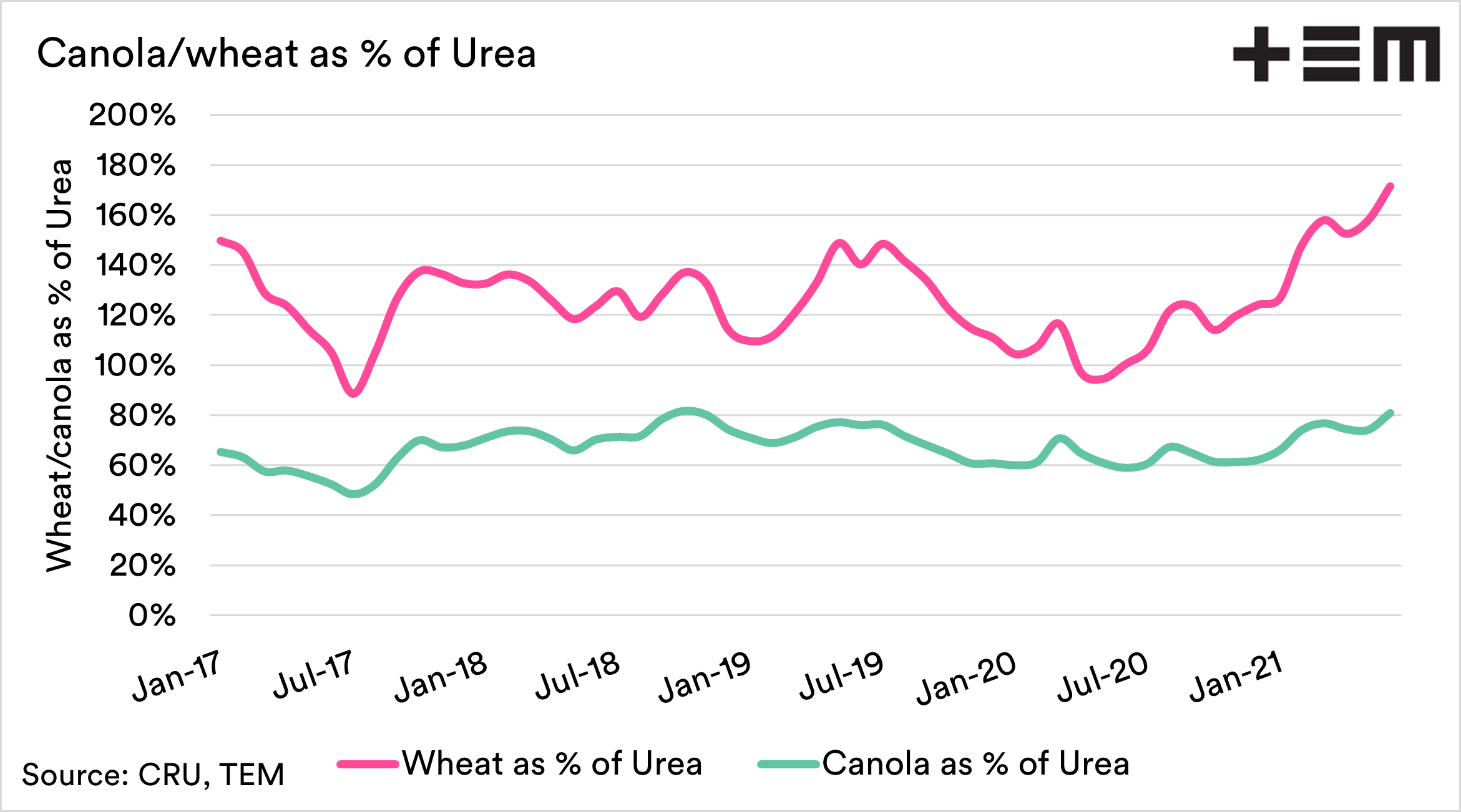
- 1mt of urea is approximately 81% of the cost of 1mt of canola. The average over the past four and a half years has been 67%
- 1mt of urea is approximately 172% of the cost of 1mt of wheat. The average over the past four and a half years has been 126%.
The Detail
Fertiliser is a huge cost for farmers in Australia (and the rest of the world). It is, however, not that regularly commented upon, especially in an Australian context. In the past week, we had a couple of requests for information on pricing.
It is essential to get a good handle on your input costs and what that market is doing to indicate when the best time to purchase is.
We have worked with independent fertiliser analysis firm CRU to develop theoretical pricing for Urea and DAP shipped to Australia.
The first two charts below show the fertiliser cost at the origin, plus the average monthly cost of freight to Australia converted to A$. The sources are Saudi Arabia for Urea and China for DAP. These are where the bulk of Australian fertilisers originate.
These charts give an idea of the trend of the fertiliser market in Australia. There will be a degree of variability between these prices and what you pay. These include additional local logistics, administration and retailing costs.
The model pricing shows that DAP has increased in price by A$199 since January, and Urea A$148.


There is a close relationship between fertiliser pricing and grains. The chart below is an index of DAP, Urea and corn pricing.
We can see that the pricing of these three commodities tends to follow similar trends both up and down. The cynic in me says that this is related to the capacity to pay; with higher grain prices, farmers have more $ to spend on inputs. To an extent, capacity to pay does have a part role.
There are also logical reasons why the price rises with the movement up in grain. A higher grain price means that farmers are more likely to put as much into the crop to maximise yield and acreage growth.
This causes demand, for a time, to exceed supply. So there is some logic behind why grain and fertiliser prices trend together.
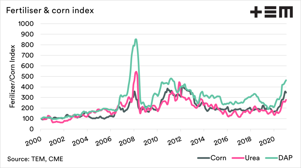
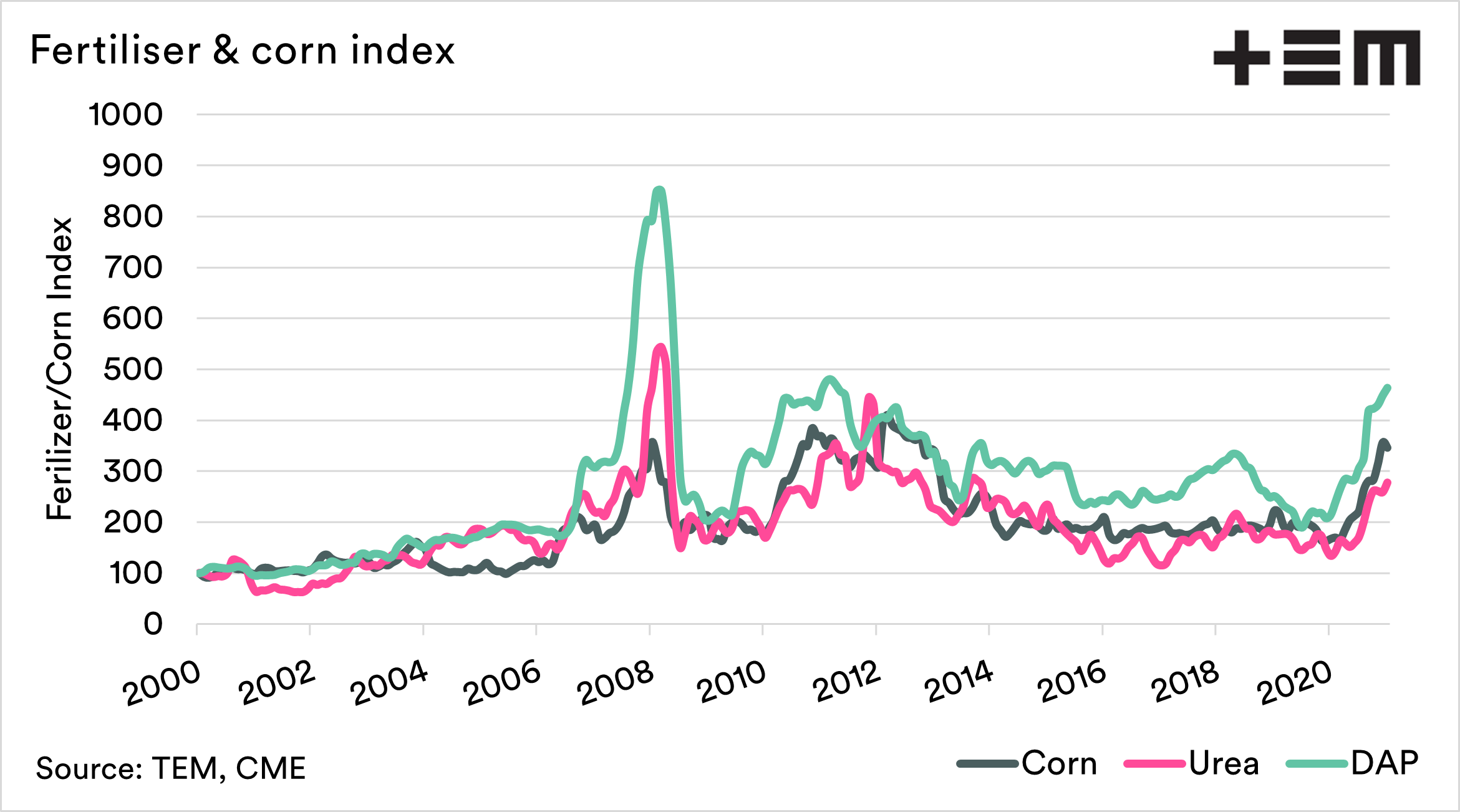
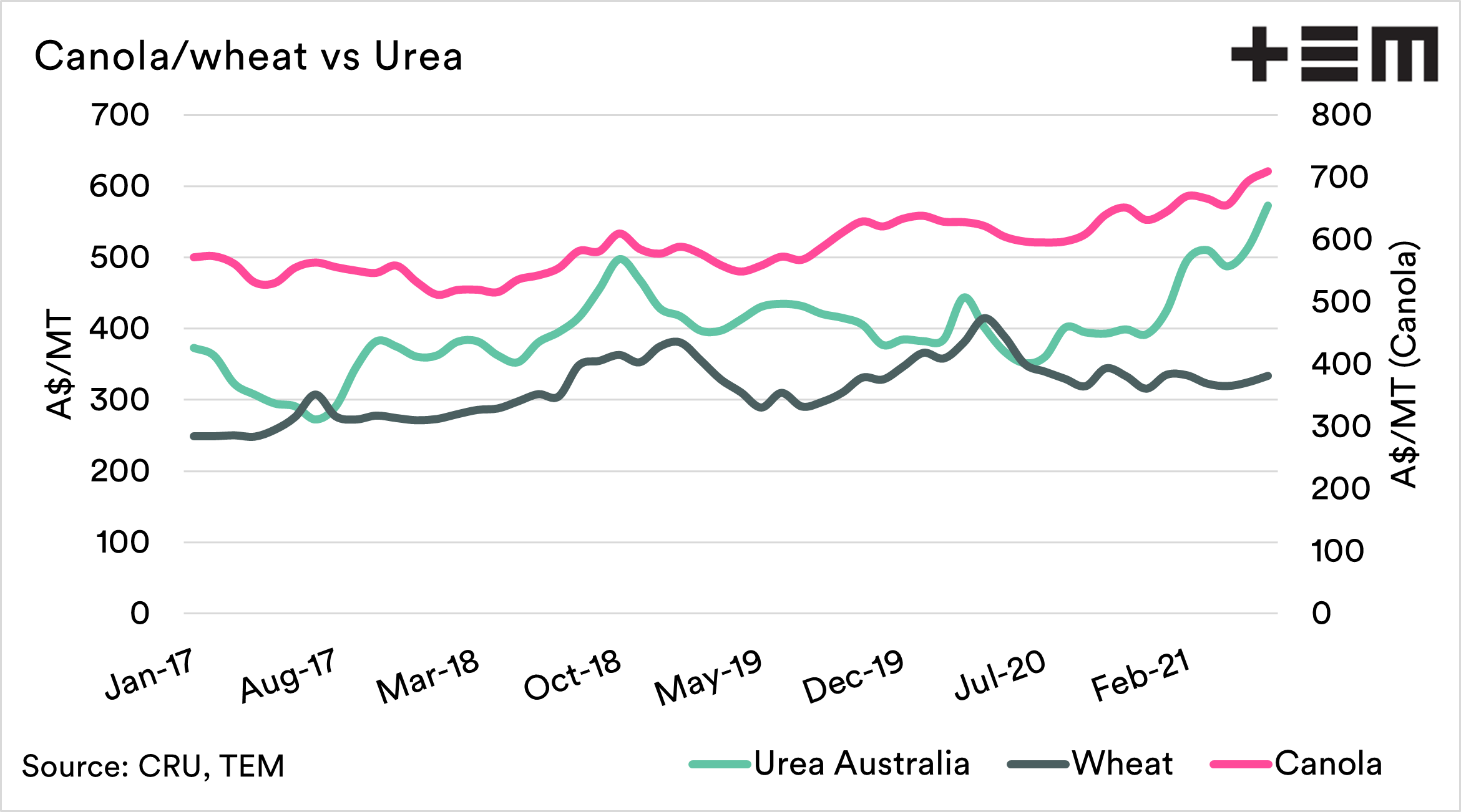
Let’s look at prices at a local level, between Urea and Wheat/canola. The correlation between corn and urea (United States) between 2000 and the present is 0.77. A perfect relationship would be 1, and no relationship 0.
The correlation between wheat (Kwinana) and urea (shipped to Australia) over the past four and a half years has been 0.45. At the same time, canola has had a stronger correlation over this period of 0.64.

We were asked an interesting question this week on Twitter (see tweet) related to the % of canola price vs urea. In this tweet exchange, we provided comparisons against overseas values.
The chart below shows the theoretical landed Australia model vs Kwinana wheat/canola. This chart shows how much you would have to sell of wheat or canola to purchase 1mt of Urea I.e. at present, you would sell 81% of a tonne of canola to get a tonne of urea.
This is the highest price that urea has cost compared to canola in the past four and a half years. The range has tended to be between 60 and 80% of the price of canola.
The rise of canola pricing in recent months has kept urea and canola in check. Wheat, on the other hand, is a different story.
The urea price is now 172% of the price of wheat. The highest that it has been in the last four and a half years. The average has been 126%.
Is urea expensive? Compared to recent history, it is costly, albeit nowhere near the levels of the commodity boom of the 2000s.
This article is intended to set the scene for where the current fertiliser market is and our output pricing. In the coming days, we will look at what some of the drivers are, and some of the expectations for pricing.

All fertiliser data for this report is completely independent, and views in this article are entirely the views of the analyst. To find out more about our independence of analysis, please read our independence charter (here).
If you are looking for in-depth, objective and independent analysis on fertiliser markets, CRU group are a great resource:
https://www.crugroup.com/analysis/
11/6/2021 – Please note Urea chart was updated as it was not displaying correct month. Figures quoted of A$573 in the article text was correct.