
Playing the highs and lows?
The Snapshot
- The peak of CBOT wheat pricing (at least for spot) has occurred during the June – August period for a large part of the past decade.
- This is logical as that period is a significant period for the development of the global crop.
- In recent years the peak has moved to later in the year.
- Averaged over time, the low in the market also tends to be around the middle of the year.
- Again, this can be due to a positive outlook on the arriving crop.
- The middle of the year can still present opportunities to lock in pricing (when attractive).
- However, it is always important to keep an eye on the market 12 months of the year for opportunities.
We like to look at seasonality, as we think along with other analytical tools, that it provides interesting insights into markets (see ‘A chart for all seasons’).
As any reader of EP3, or follower of us on Twitter can attest to – we really like charts. We especially like to test new ideas.
A few weeks ago, I wrote about my excitement for the coming months (see ‘Grains are about to get exciting’). This period of the year is when the northern hemisphere crop is either in the growing phase or harvested. If anything goes wrong, then boom!
A question we received was, “what does this mean for pricing?”.

Grain producers should be thinking strategically regarding their selling. That should at least include understanding the futures market and its impact upon pricing, even if not using derivatives to market your grain.
We have found many times when the market rallies but quickly loses its steam. At times a concern can drive the market, pushed by speculators, and then find that the problems were overdone.
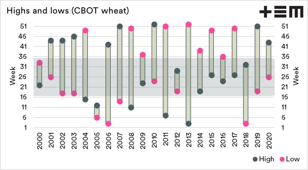
Where has the peak been?
The chart* below shows the highs and lows for CBOT wheat (spot) for each year between 2000 and 2020. The peaks are shown as a grey circle and the lows as a pink circle. Throughout the majority of the period since 2010, the peak has been during the middle of the year. The past two years have reversed this trend.
Notably, the lows, have trended over the past decade towards the end of the year
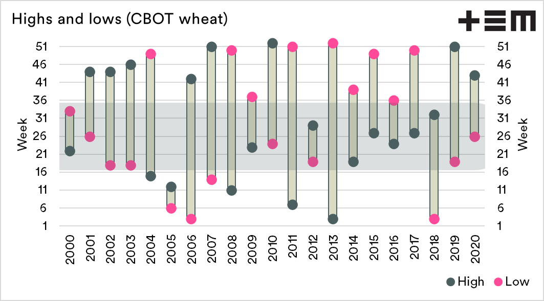
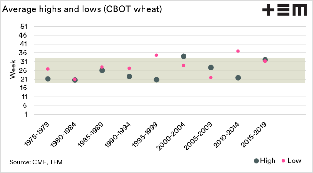
It is also worthwhile looking at the longer term. The chart below displays the period 1975-present. This data is displayed in 5-year blocks. On average, the peak (and troughs) tends to be located in the middle of the year between June and August.

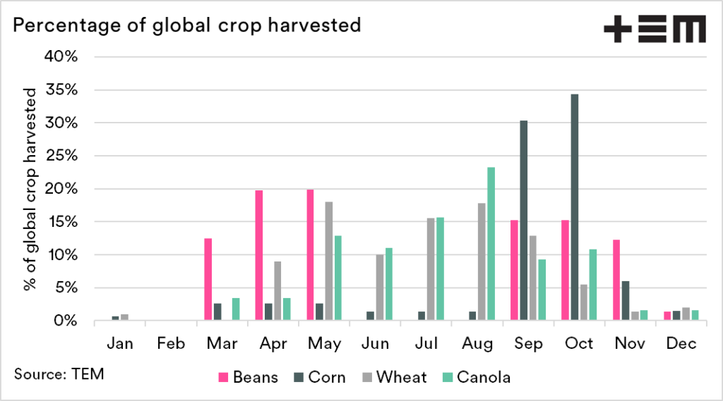
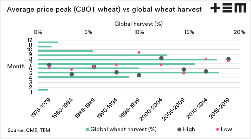
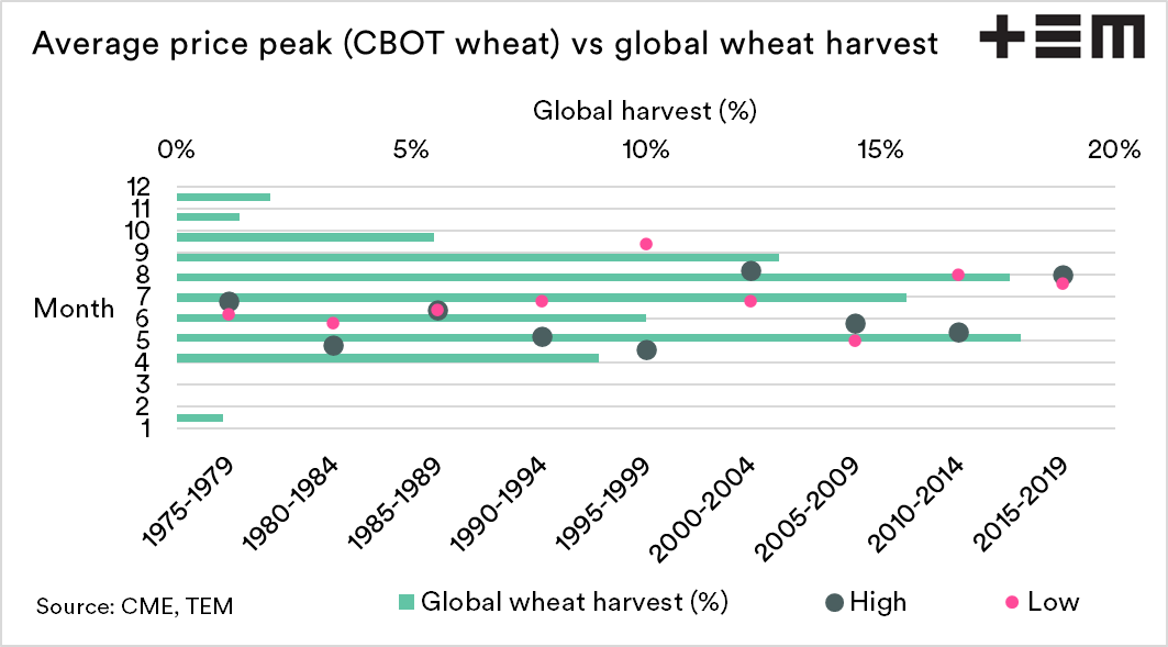
Comparison against global harvest.
The chart below combines the five-year average in the previous chart, along with the percentage of the worlds harvest.
Whilst this is quite a busy chart, it does show the relationship between highs and lows and the bulk of the growing/harvest period.
*We’d like to thank Sam West for his invaluable design tips to improve the efficacy of this chart (see here)