Where to protect your wheat price?

The Snapshot
- There are many wheat futures contracts you can use to protect against adverse price movement, for farmers and consumers of grain.
- The ‘further’ an exchange is from the physical market, the less likely it is to correlate. This ‘distance’ could be location or quality.
- The Australian contracts have the strongest correlation with Australian prices, which makes sense.
- If there is a drought in Australia, the market should turn into a domestic market – especially in the eastern states.
- MATIF (French) wheat has the most consistent correlation with Australian wheat prices in recent years.
The Detail
Production risk is undoubtedly the biggest risk Australian farmers face when planting a crop. When we plant in April/May, we face all the dangers of a volatile climate. In reality, we have some of the most volatile productivity in the world.
In an ideal world, we’d have no production risk, so we could focus a little more on our price risk. The price risk is probably the second largest risk faced by a cropping farmer (or grain buyer).
There are many ways to manage price risk, and one of those is through futures contracts (or swaps). I have taken two port zones in this analysis, Kwinana and Port Kembla. Western Australia is export-dominated, and Port Kembla has a much greater domestic market.
I want to look at the most closely correlated markets with Australian pricing.
Firstly, what is a correlation?
Correlation is a way to measure how two things are related. As an example, if the price of wheat in the physical market rises, which is related to an increase in wheat futures prices, that’s a positive correlation. If the cost of wheat in the physical market rises and this is related to a decrease in wheat futures prices, that’s a negative correlation. The strength of this relationship is shown with a number between -1 and 1. A number close to 1 means a strong positive link, close to -1 means a strong negative link, and close to 0 means no link at all.

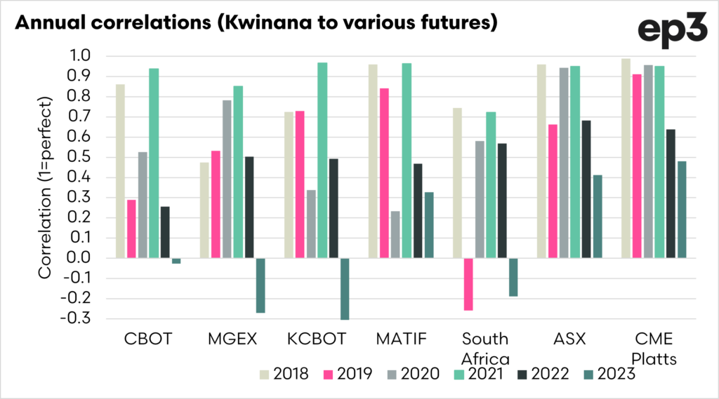
Kwinana
I have chosen to analyse the Australian market against a wide range of future contracts. These are CBOT (Chicago), MGEX (Minneapolis), KCBOT (Kansas), MATIF (France), SAFEX (South Africa), ASX (East Australia) and CME-Platts (Western Australia). It is important to note that this is the spot contract versus spot contract.
The one key highlight from this analysis is how variable the correlations can be, especially in overseas markets. The closer a futures market contract is to the physical, the closer the relationship will be.
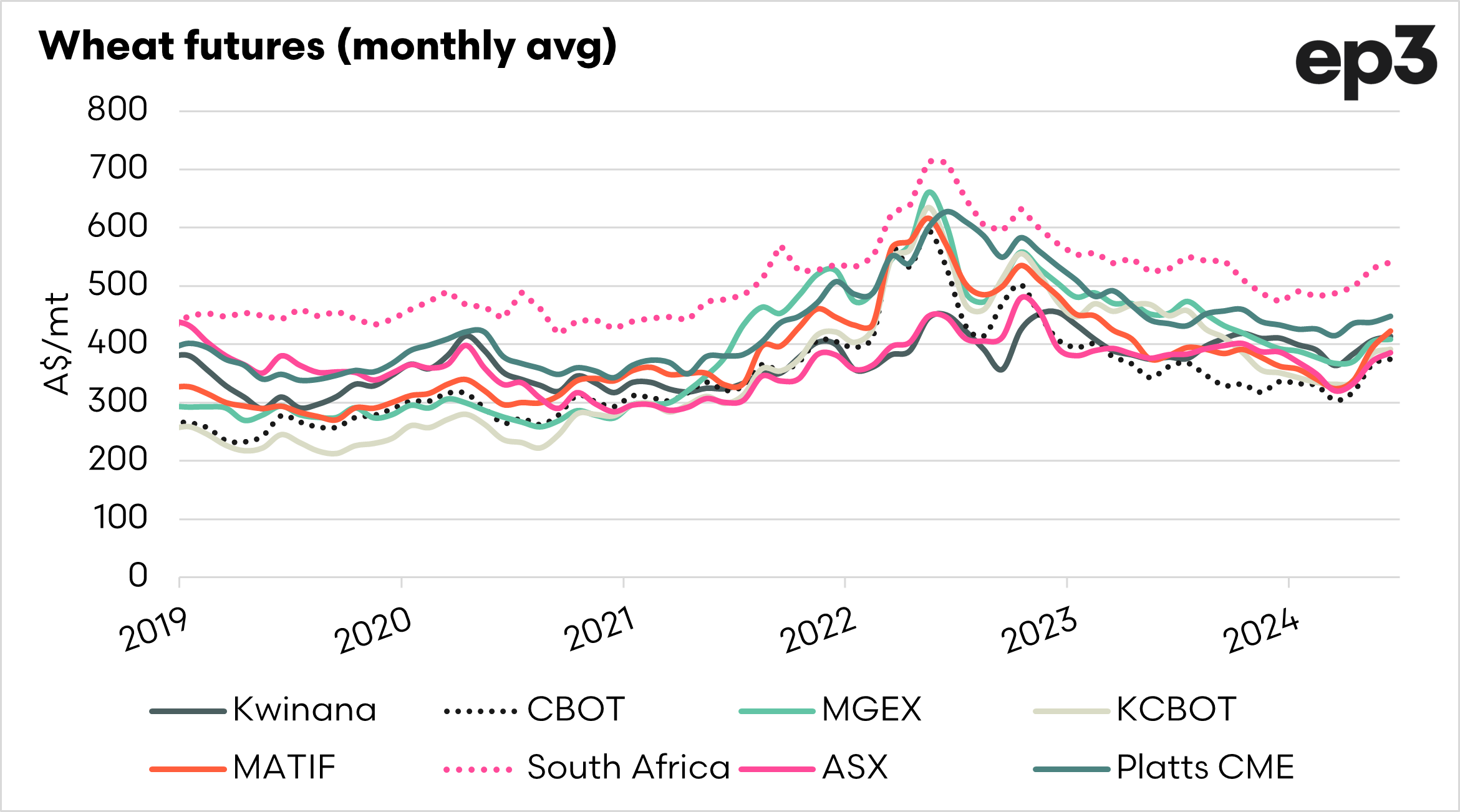
In the first chart we can see that generally markets tend to trade in very similar patterns, and follow one another, but big swings can be hard to see in a line chart.
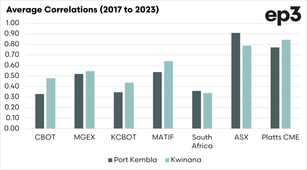
In the second chart, I have displayed the annual average correlations for each of the contracts.
The variability is huge. For instance, US wheat can correlate highly on an annual basis but can also have a negative correlation.
The contracts with the highest annual correlation are, in order, CME Platts (0.84), ASX (0.79) and Matif (0.64).
The reality is that these correlations can change, but based on longevity, these contracts have the closest relationship to what is happening at the physical level.

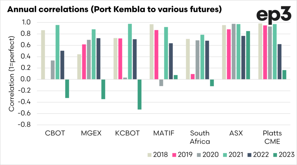
Port Kembla
The reason that I chose to compare both sides of Australia was because of the very different markets. A large proportion of Australian domestic demand is located in New South Wales.
The market in the eastern states is far more heavily swayed by what is happening locally than in Western Australia. The eastern states will become almost a fully domestic market in a drought year. In a Western Australian drought, the market is still an export market.
So we would expect that the correlations would likely to differ. That is the case. In the chart below, we can see that the correlations are a lot more variable for the overseas markets than they are for Western Australia.
The Australian markets, as expected, have the highest correlations, but the CME Platts, which is WA-based, has a lower correlation, and the ASX has a higher correlation. This is how it should be, as they should reflect their local markets closer.
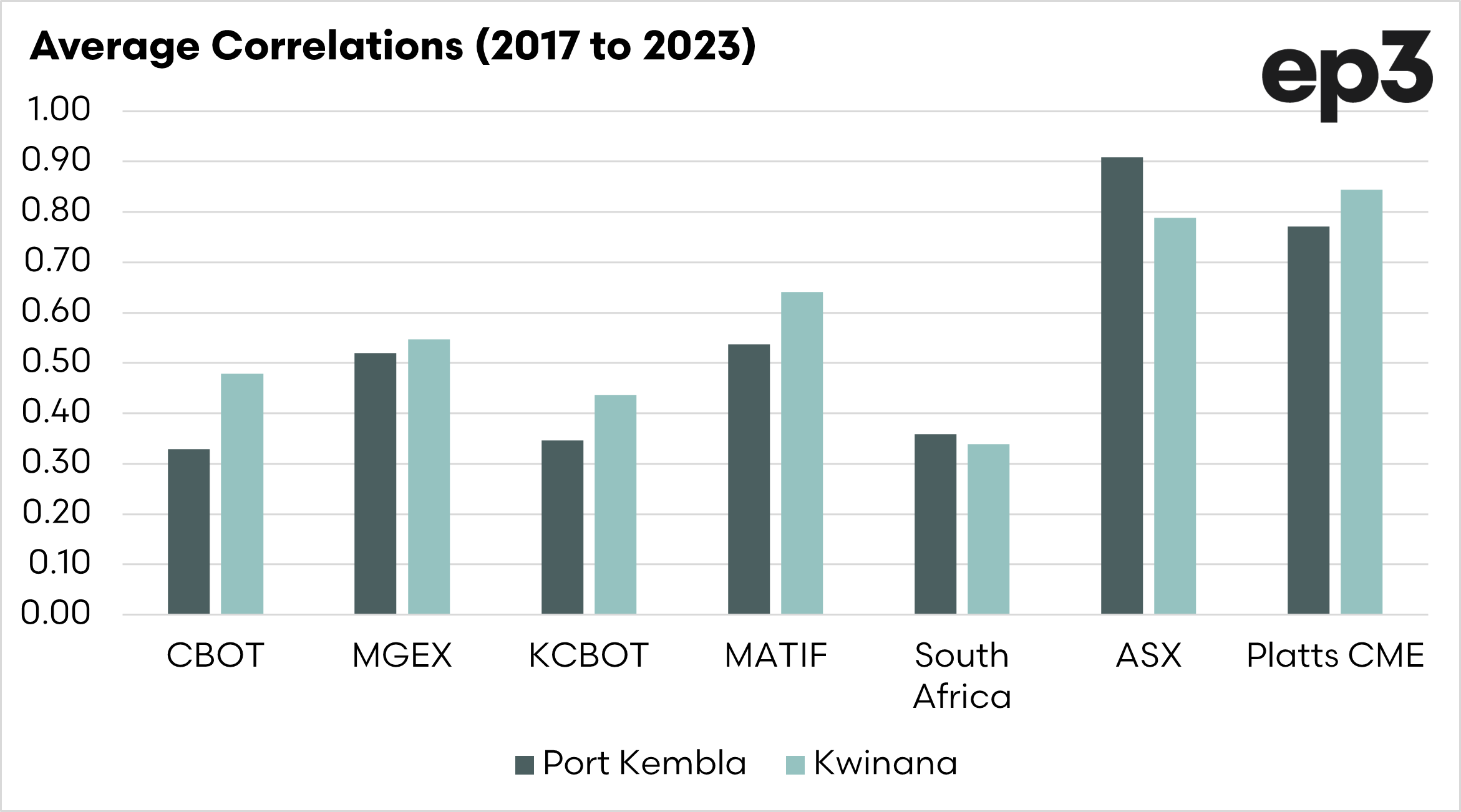
The second chart shows the average annual correlations for 2017 to 2023, and again, see that MATIF is the strongest overseas market for correlating with Australian pricing.
MATIF would also give much more exposure to events in Russia, as per this article.