Wheat: The market that falls as fast as it rises.

The Peaks
My distinguished colleague, Matthew, wrote about the changes in sheep pricing from peak to trough. You can read this article by clicking here.
It was clearly a copy of my article from last March about the peaks in wheat pricing. In light of the clear plagiarism, I thought I would update my wheat datasets and go in a little further.
The Peaks
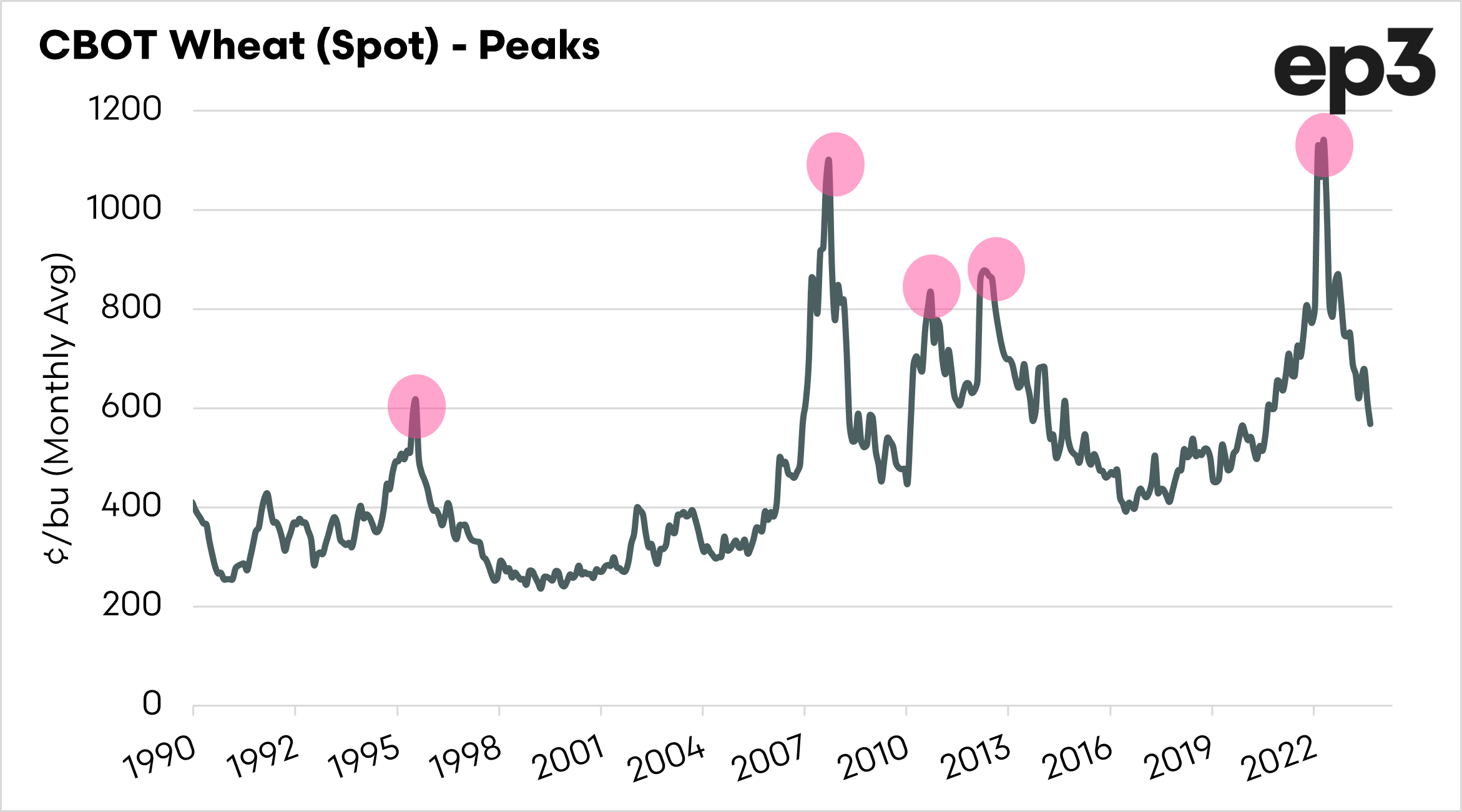
A series of very sharp peaks have characterized the wheat trade. The chart below shows the main peaks of wheat since 1990. These were:
- May 1996
- March 2008
- February 2011
- September 2012
- May 2022
What we can see in the chart below is that very quick collapses follow the peaks. The market tends to lose steam very quickly.

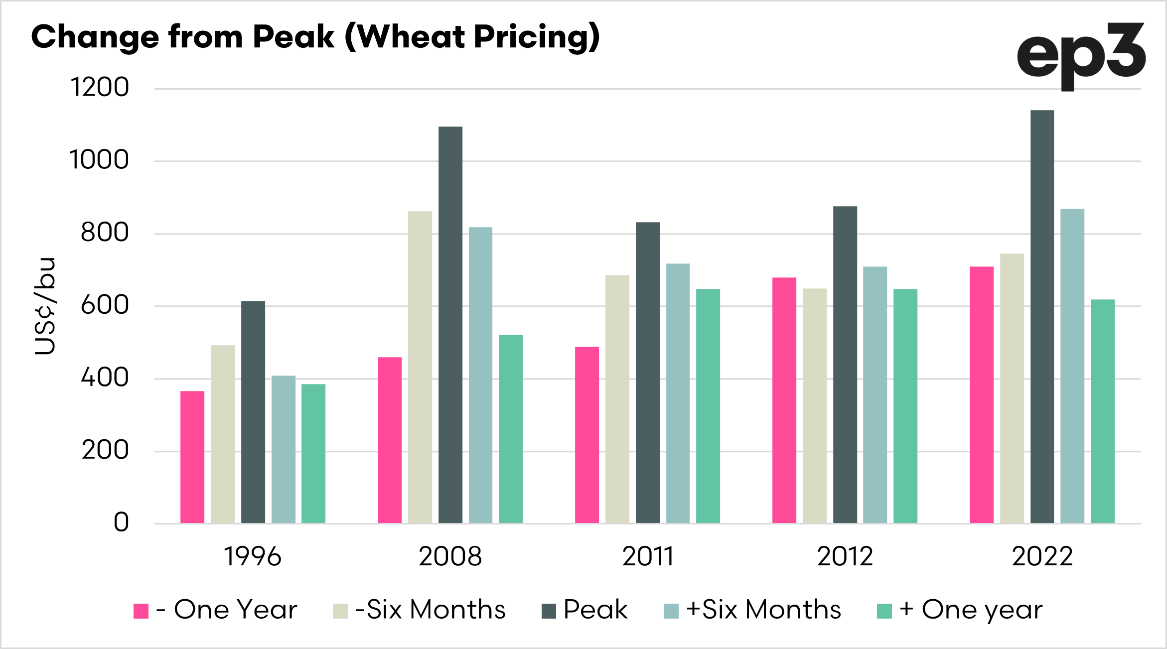
The gains and the losses
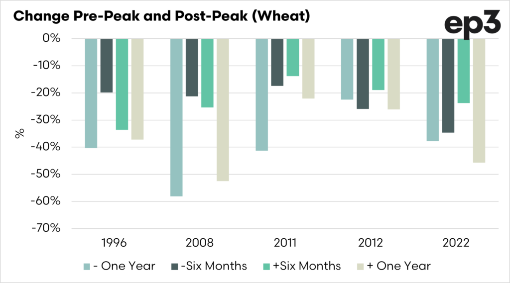
What were the changes to the market in the period before and after the peak? The first chart below shows the peak, and the price for six months/twelve months before and after.
We can see that after the peak, the market essentially gave back all the gains, plus more in many cases. The second chart shows the % change to and from the peak for these periods.
It makes for quite interesting reading, on average:
- The market increased 40% to the peak from the year prior
- The market decreased 37% from the peak to a year later.
- The market increased 24% to the peak from six months prior.
- The market decreased 23% from the peak to six months later.
Overall, on average, the market tends to return pretty much back to the levels that it was prior to. It’s a fast rise but an equally fast fall.
If you remember one thing: “Low prices are the cure for low prices, and high prices are the cure for high prices“